Pinterest Colour Trends for Autumn/Winter 2025: The Shades Everyone’s Searching For

Share

From paint to décor, 2025’s colour trends prove that subtle shifts in tone can completely transform how a home feels.
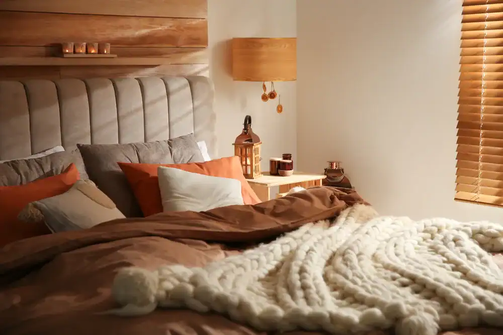
As the weather cools and the days grow shorter, this year’s palette invites a return to warmth and comfort. We’re moving away from the stark whites and icy greys of minimalism and leaning into depth, texture and quiet luxury. Designers and homeowners alike are embracing colours that soothe and steady: velvety browns, soft greens and earthy reds that bring the calm of the outdoors in.
According to Bluefield Realty Group, these tones aren’t just shaping décor, they’re also influencing how buyers connect with spaces. Homes styled in warm, natural hues photograph better, feel more inviting, and spark the kind of emotional response that turns interest into offers.
The Autumn/Winter 2025 Palette
- Mocha Mousse: Named Pantone’s Colour of the Year 2025, this velvety brown neutral has become the anchor shade of the season. Its chocolate undertones create warmth and depth, confirming that brown’s resurgence is more than a passing trend.
- Rich Burgundy: This wine-toned hue has appeared across fashion runways and interior paint collections. It adds quiet drama and a sense of old-world sophistication to any space.
- Sage or Olive Green: Emerging from the continued influence of biophilic design, these muted greens evoke a sense of calm and a connection to nature. They bring balance and a sense of serenity to modern interiors.
- Warm Taupe or Caramel: This golden neutral is replacing cooler greys in 2025. It offers balance, softness, and versatility, allowing it to work beautifully across both light and dark interiors.
- Burnished Gold Accent: Inspired by the revival of brushed metals and antique finishes, this tone adds a gentle glow that feels refined rather than showy. It captures the quiet luxury that defines this year’s design direction.
How to Use the Palette at Home
- Layer your neutrals: Start with a base of Mocha Mousse or Warm Taupe on walls and larger furniture pieces. These tones create warmth without overwhelming a space and pair beautifully with natural light.
- Add depth with contrast: Introduce Rich Burgundy through accent walls, upholstery, or artwork to bring richness and character. It provides visual interest without breaking the palette’s harmony.
- Bring nature indoors: Incorporate Sage or Olive Green through soft furnishings, cabinetry, or plants. These tones connect interiors with the outdoors and enhance a sense of calm.
- Use gold as a highlight: Burnished Gold works best in small touches, such as light fittings, handles or mirror frames. Its subtle sheen adds sophistication without feeling showy and reflects the broader move away from high-gloss chrome.
- Balance texture and tone: Combine these shades with tactile materials like linen, wood, and brass to create depth and dimension. The result is a home that feels inviting, layered, and timeless.
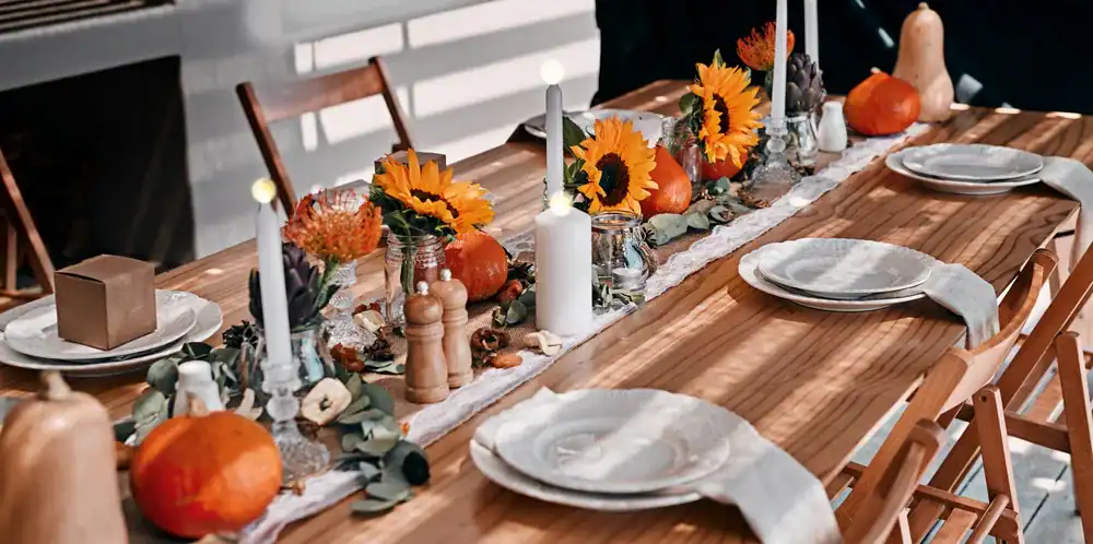
“This autumn and winter, interiors are embracing nature’s most comforting tones. The 2025 palette moves away from stark contrasts and towards rich, layered harmony, drawing inspiration from Pantone, Dulux, and leading design week forecasts. These shades bring a sense of balance and calm that feels especially relevant in today’s homes.
This season’s colours are designed to make interiors feel grounded, comforting, and effortlessly elegant. When used thoughtfully, they elevate a space without overwhelming it. Warm neutrals and muted tones create a backdrop that feels sophisticated yet inviting, while subtle metallics like burnished gold add just the right touch of refinement.
For sellers, this palette can make a property feel more desirable by adding warmth and cohesion, which can resonate strongly with potential buyers. For homeowners, it offers a simple, stylish way to refresh interiors while staying ahead of the design curve. Ultimately, the right palette helps a house feel like a home, and that emotional connection is what buyers remember most,” says Real Estate Expert Michael Smith from Bluefield Realty Group.
Autumn Scents: The Best Candles and Diffusers for the Season Ahead